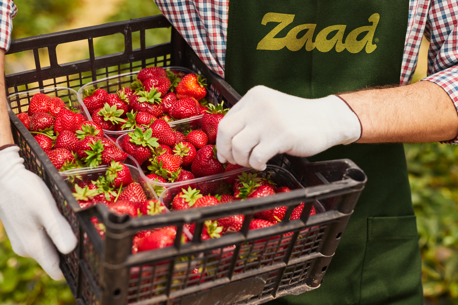
Zaad Farms®
Our great dream began more than 25 years ago when we set the core concept of our entity; Food is the basis of human presence; pure food is a healthy life. This fundamental principle prompted us to act and to set a clear goal; provoke change in agriculture and contribute with our long-standing experience and our lofty ambition to the development of the field.
The stages of agricultural production and its logistical services are an integrated process done through sequential and deliberate steps that enable the company to guarantee the provision of international quality products in the required quantities and in time to the needs of customers.
Services:
Brand Identity
Corporate Identity
Brand Narrative
Art Direction
Illustration
Animation
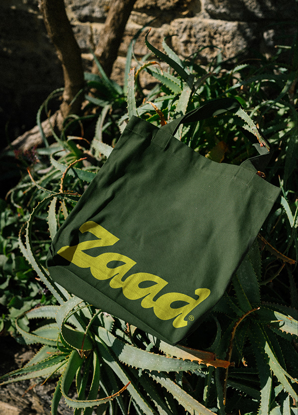
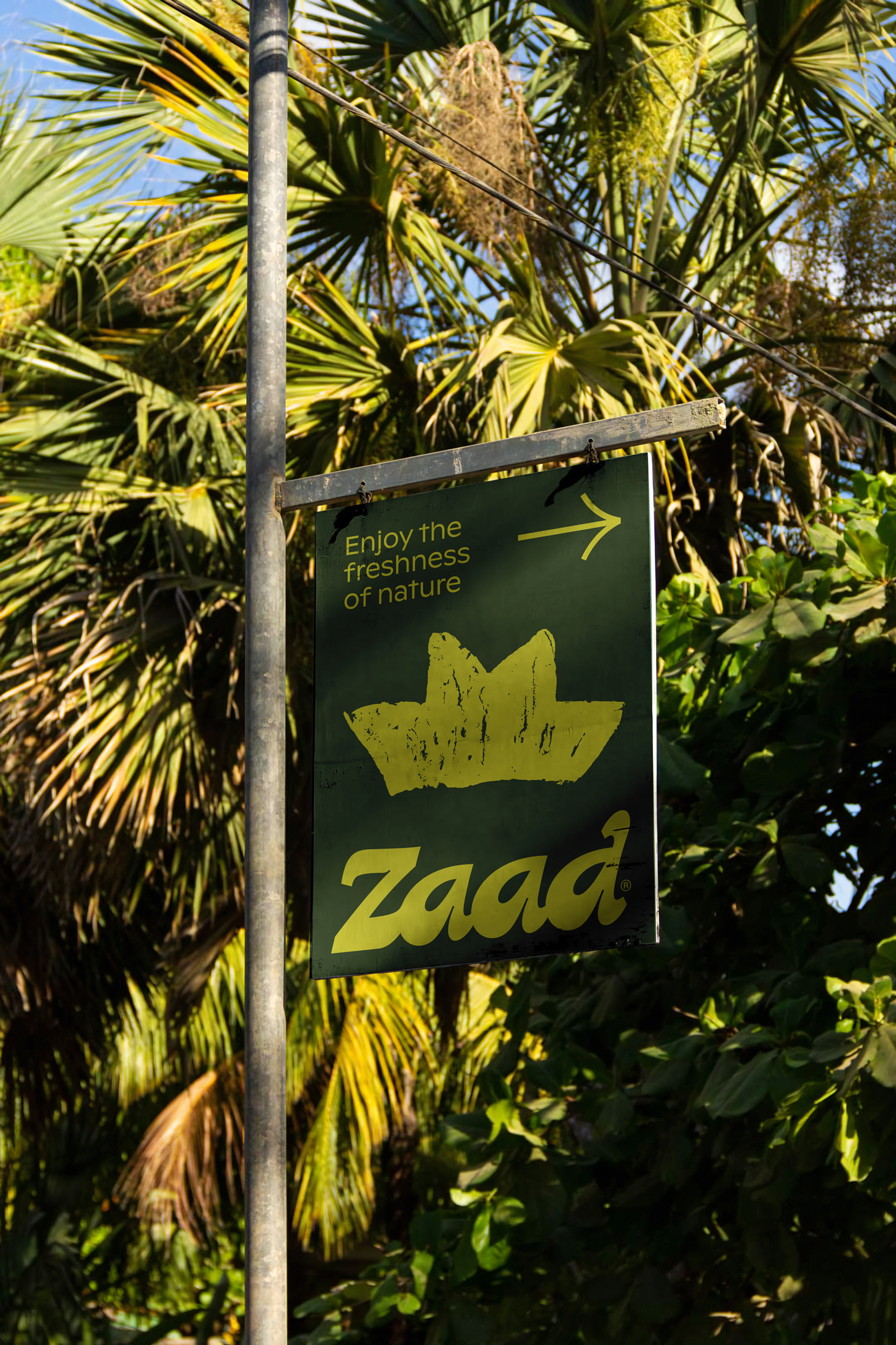
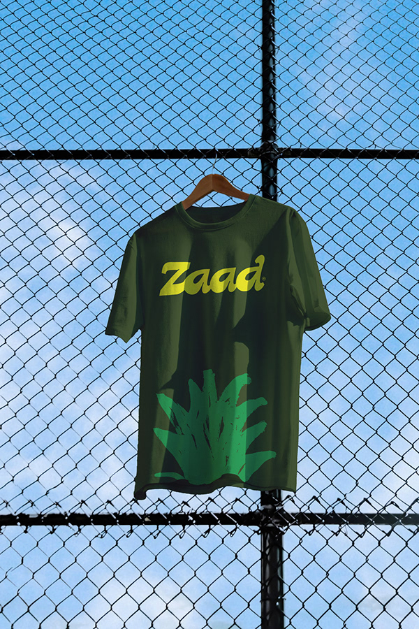
Zaad Farms, through its ability to provide its integrated agricultural experience, has been keen to consolidate this idea in the new logo that represents it on every label on its packed crop.
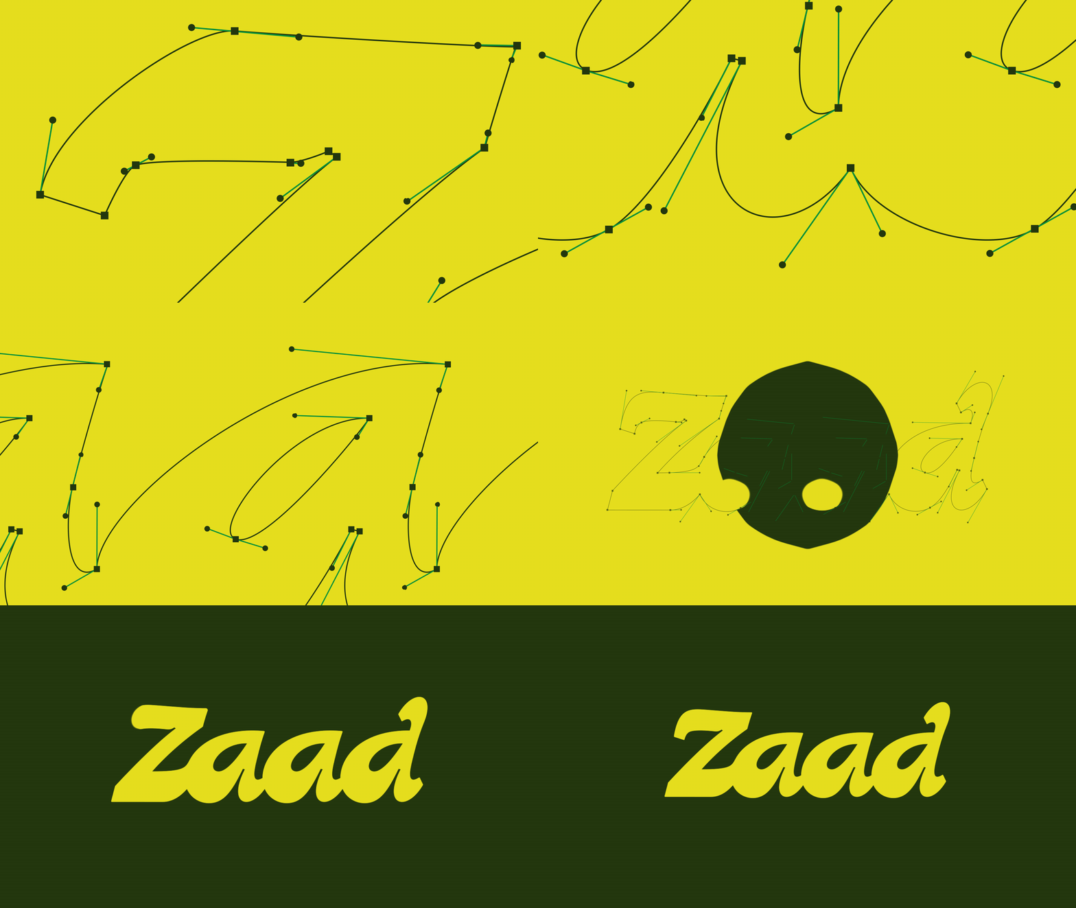
Studying the letters of the company's name, "Zaad," the stages of production, and the logistical tasks, we made it possible to identify points at the heart of the company's work to be relied upon in the logo design.
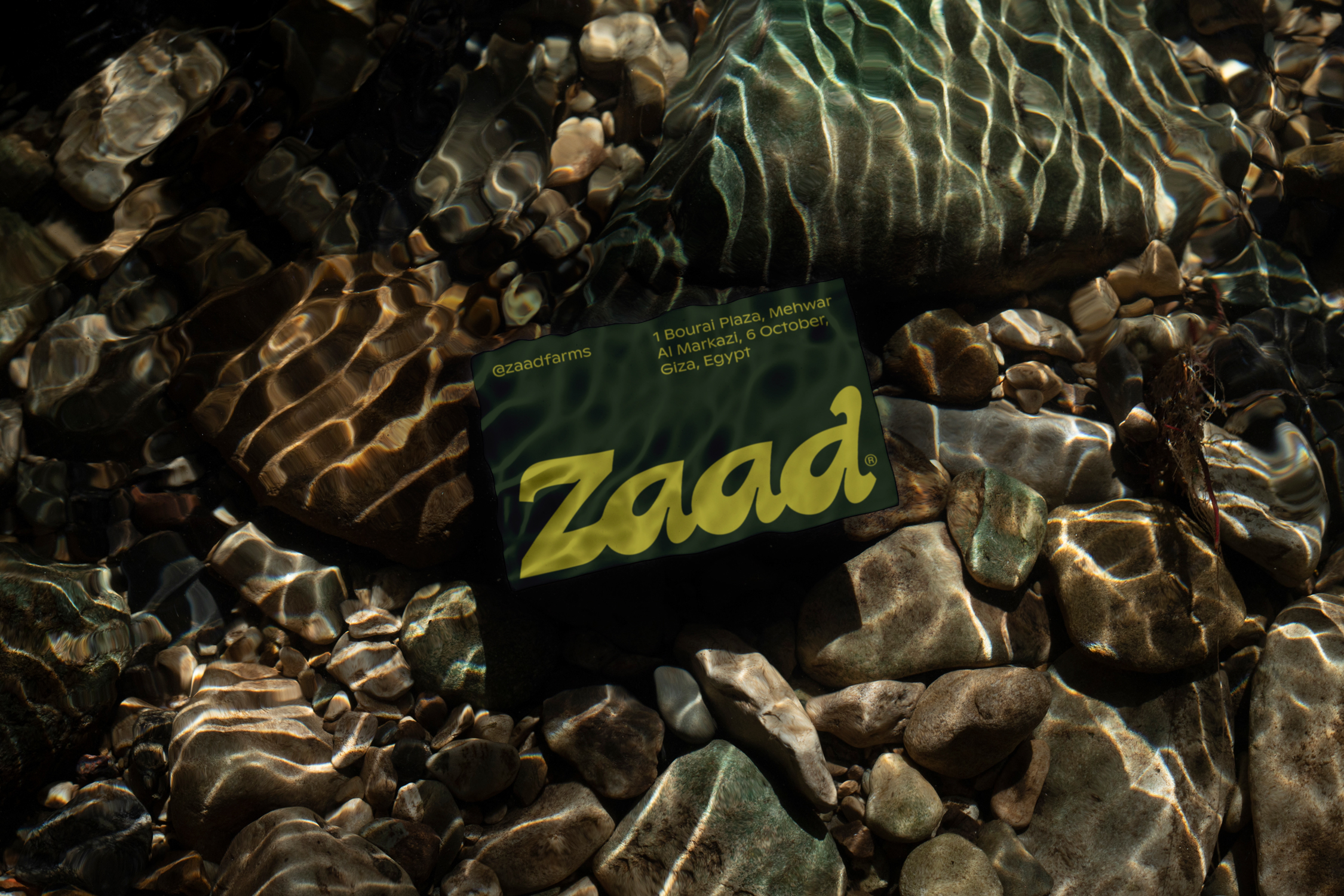
That was through drawing and designing the letters of the logo in a way inspired by the integrated agricultural experience, starting from the seed, the water point by which it's irrigated and its growth into a leaf of a plant, to the packaging, shipping, and export of products so that we have a logo with connected letters that indicate the company’s connection to each stage of production and its ability to communicate and export all over the world.
The connection of letters to each other results in curves that resemble those curves that are formed in the land after plowing, planning, and cultivation. All in a diagonal line that creates a sense of speed, coherence, and confidence.
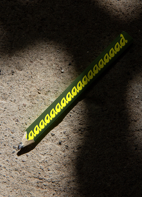
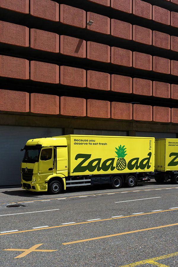
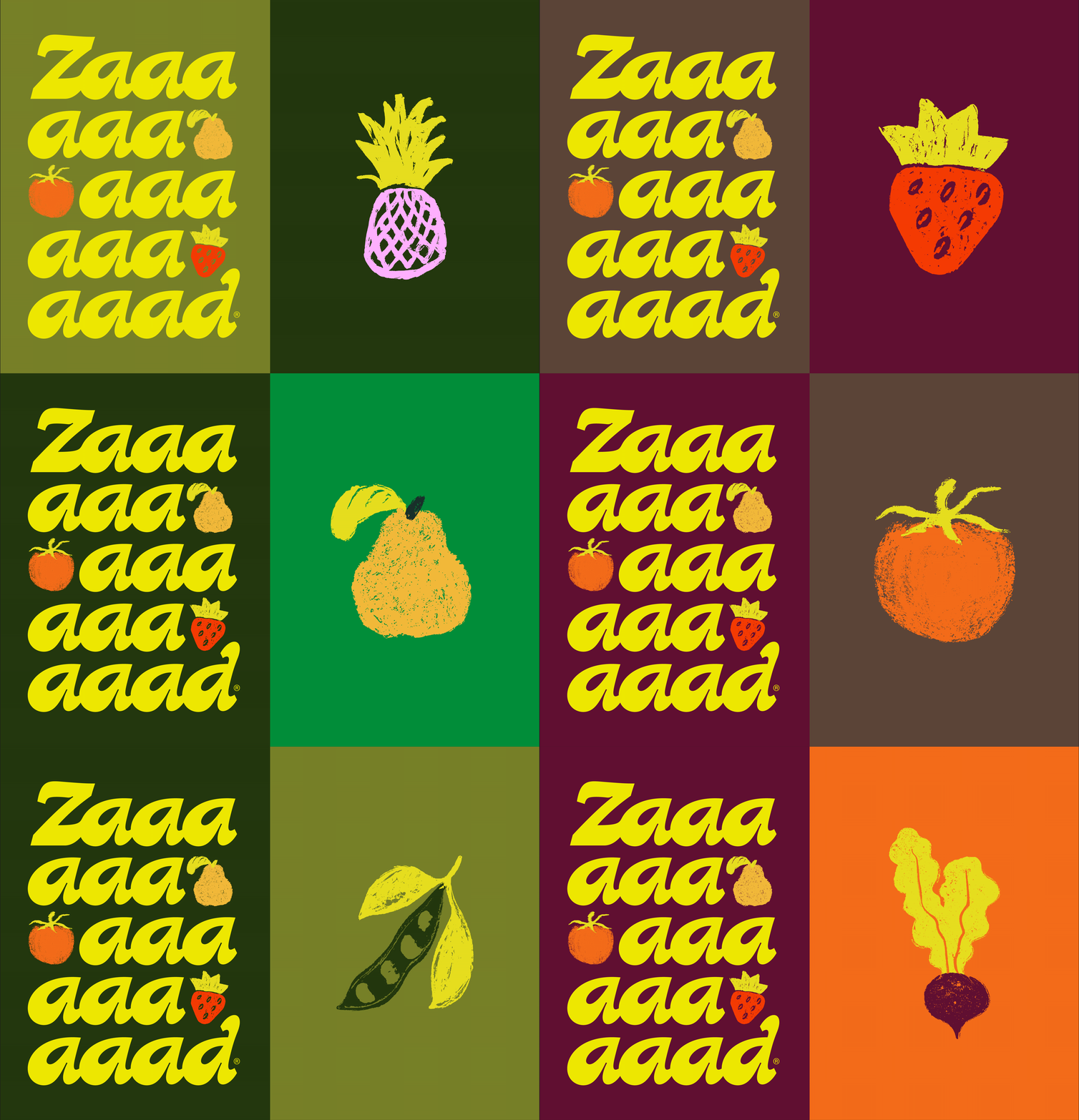
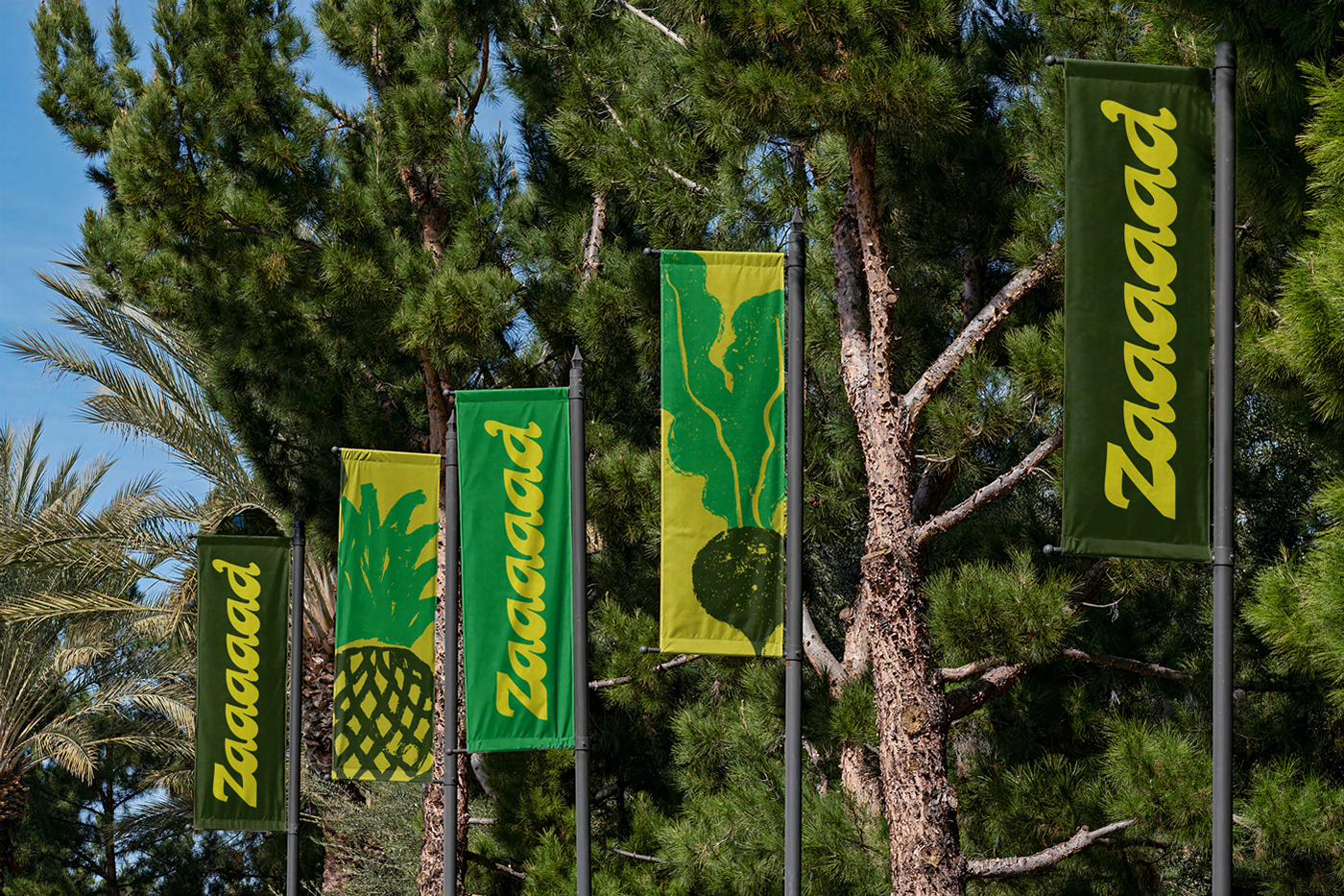
Zaad is an Arabic word that refers to abundance and growth. This concept inspired us with an essential pillar in our visual identity, which is the possibility of extending the logo by doubling the letter a, which distinguishes the logo and gives it the flexibility to suit and conform to various places in our identity.




News
Gallery
Inquiry
