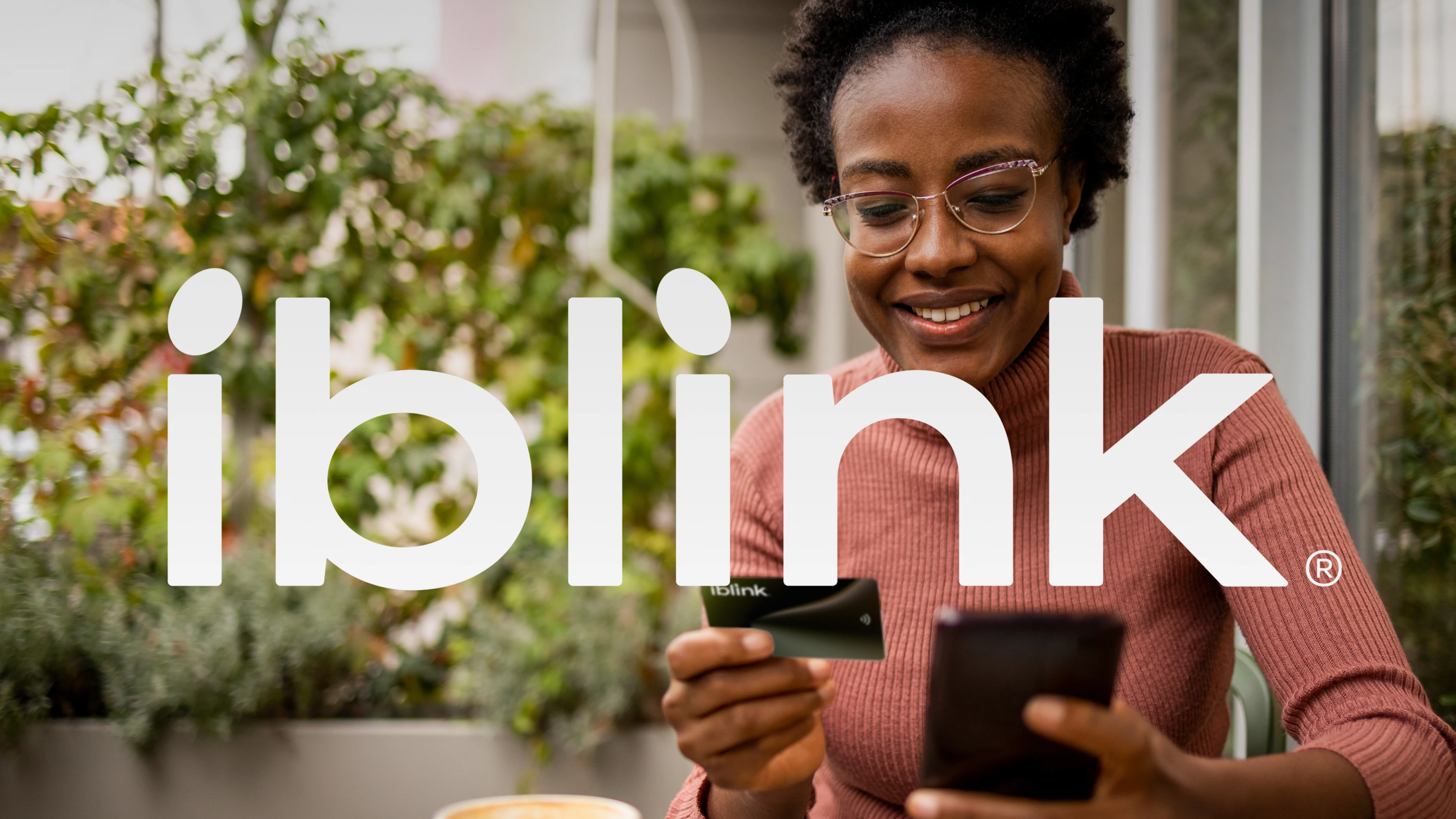
iblink
Companies are racing to innovate solutions and break new ground in developing their capabilities to ensure they provide their services in a manner that keeps pace with the age of speed. iblink is going ahead smoothly in the world of e-commerce with a product that combines speed and intelligence to be a pioneer in the use of modern technology.
By observing and analyzing the movement and trajectories of objects and the curves of NFC waves and data transmission simple waves, we can see that they form curves similar to NFC shape curves and data transfer curves. Each curve consists of several points that differ in composition and shape according to their speed, starting from the circular shape, which represents the lowest speed, to the ellipse, which represents the fastest point in a curved trajectory.
Services:
Brand Identity
Corporate Identity
Brand Narrative
Art Direction
UI Design
Animation
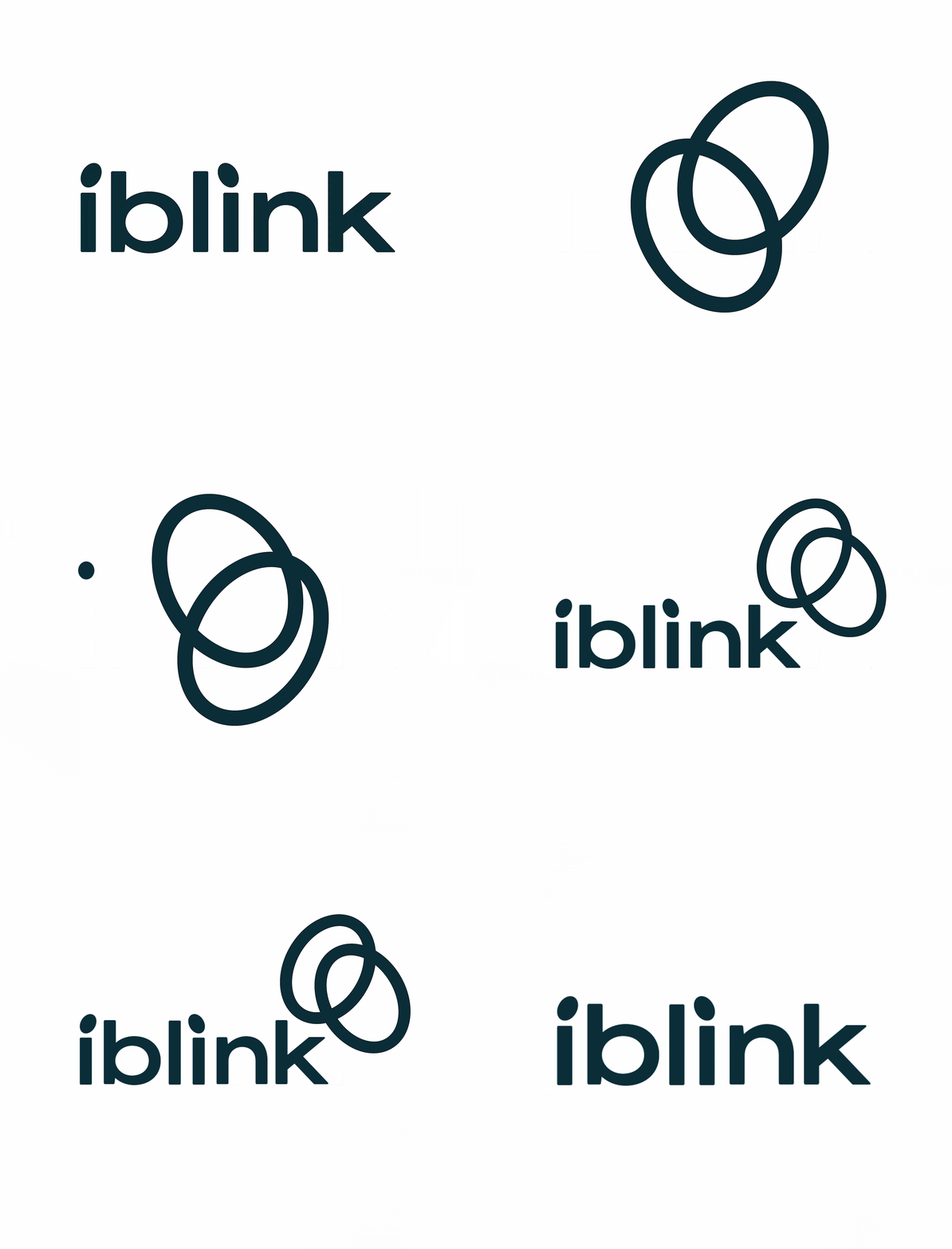
We used the ellipse to represent the maximum speed, and we represented the dot above the letter "i" as the starting and receiving points on the data transfer curve. The data transfer process starts quickly from the first "i" as you begin to utter the company name and reach the second "i" at full speed before you finish pronouncing the iblink name.
Our logotype is approachable and easy to read. Optical kerning, refined weight, defined clear space, and well-delineated placement in relation to other content all help make it as instantly recognizable as possible.

Inspired by the many forms generated by the connection processes between the phone and the card in NFC feature, we came up with the idea of designing a variable icon that expresses the potential and different positions each time a connection came, using the tittle of the letter “i” to represent the two ends of the connection. This difference reflects the perpetual changes and development the company applies to its services to ensure its leadership in smart solutions.
The resulting logo represents how the connection and the speed between iblink and its customers are continually enriched each time they interact with one another and enables us to build a visual language that is robust yet agile, modern yet trustworthy. An identity that is as dynamic in nature as the company itself.

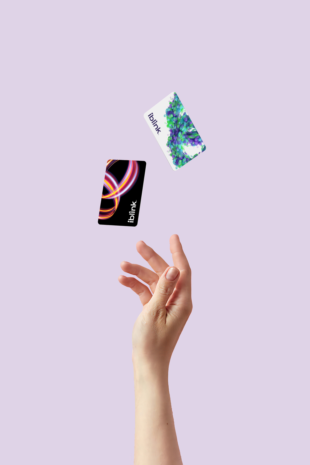
Standard card
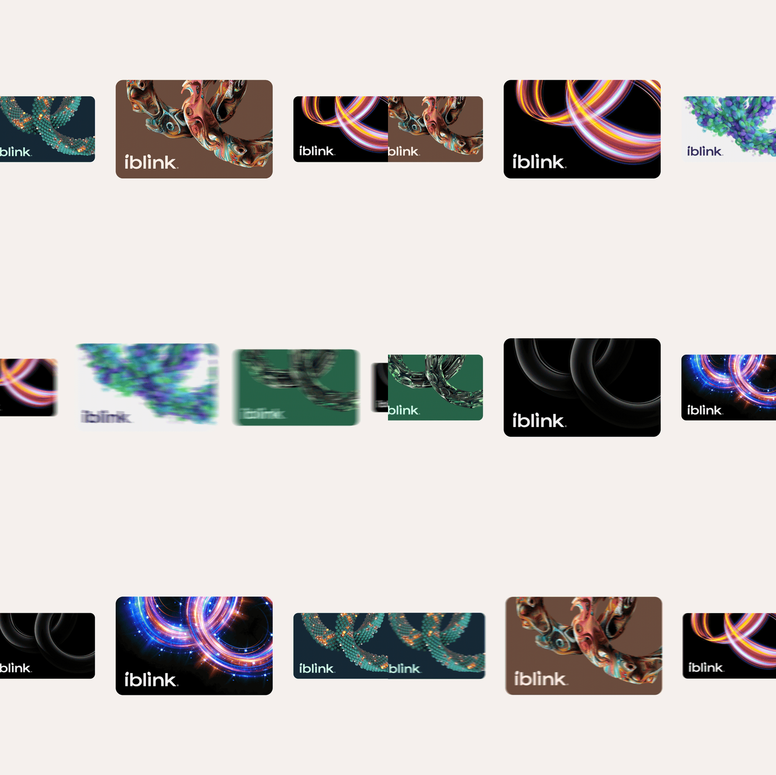
Premium card



News
Gallery
Inquiry

